McKenzie and Sons - a painting business that needed to look established
A local painting turnkey solutions business.
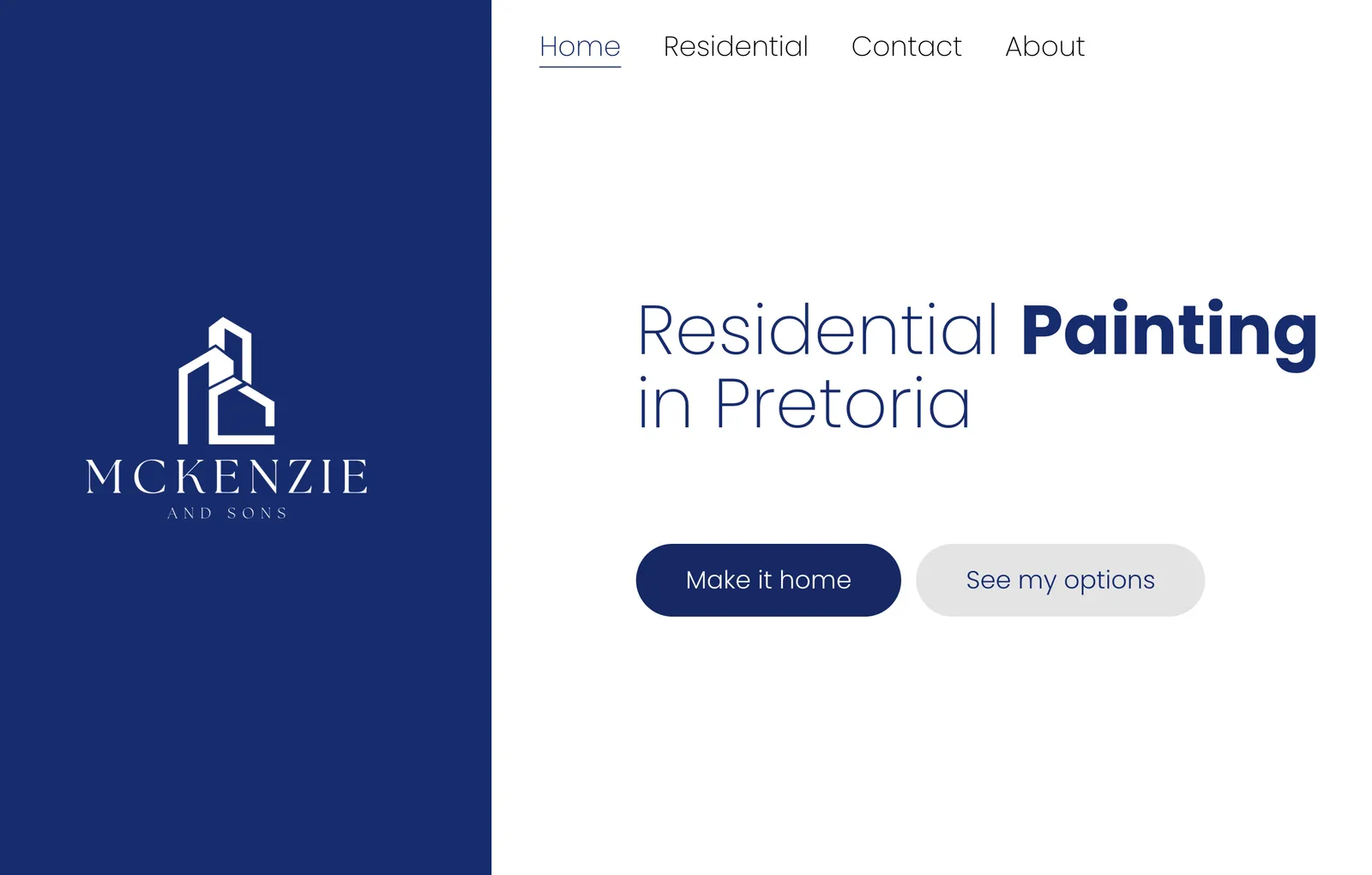
The project brief
A Pretoria service business with a strong local reputation and nothing online to match it. The site had to make a first-time visitor trust the business within seconds and give them one obvious way to make contact.
Our mission
Make a long-established Pretoria painting business look as trustworthy online as it is in person, and give every first-time visitor one obvious way to make contact.
The main issues to solve
- 01Established business, no website - just a Facebook page that did not rank
- 02Customers were phoning to ask basic questions the site should answer
- 03Needed to read as a serious, long-standing company, not a side hustle
- 04One primary action: get the visitor to call or send an enquiry
Design decisions
What a service business actually needs from a homepage
For a service business the website is a credibility check, not a catalogue. Before anything else a visitor is asking: are these people real, have they done this before, and how do I reach them. The homepage was built to answer those three questions above the fold - who the business is, proof of past work, and a contact action that never scrolls out of reach.
- Clear statement of what the business does and where it works
- Proof early: real project photos, service area, years established
- Phone number and enquiry button fixed in view on every screen size
- No jargon, no stock-photo hero - photos of actual work
Professional over creative
There is a fork on every build: lean professional and restrained, or lean creative and expressive. A creative, animation-led design signals a studio or a brand that sells on taste. A service business sells on reliability, so the design stays quiet - a tight type scale, generous whitespace, one accent colour used only on the call-to-action. The visitor should notice the work, not the website.
- Conventional layout a visitor already knows how to read
- One accent colour, reserved for the primary action
- Real photography over illustration or motion
- Nothing on the page competes with the contact button
Minimalism and speed over animation
The site was kept deliberately minimal: few pages, no carousels, no scroll-triggered effects. That is a performance decision as much as an aesthetic one. A service-business visitor is often on mobile data, mid-task, deciding in seconds whether to call. A page that renders almost instantly converts better than one that animates in.
- Static pages, no client-side rendering for content
- Images sized and compressed for mobile, lazy-loaded below the fold
- No third-party scripts beyond privacy-friendly analytics
- Passes Core Web Vitals on a mid-range phone
How it was built
- Type
- Static website - no database, no login
- Framework
- Next.js, exported as static HTML
- Hosting
- Edge CDN, global cache, free SSL
- Content
- Copy baked in at build time; edits are a redeploy
- Forms
- Enquiry form posts to a serverless function that emails the business
- Analytics
- Privacy-friendly, no cookie banner needed
Want a website built the same way?
Every build starts from a fixed published price and timeline.
Pick your type, or WhatsApp Matt and get a straight answer on what your business needs.