Kays Lens Co. - a creative whose work had to lead
A photographer's portfolio presented the best way.
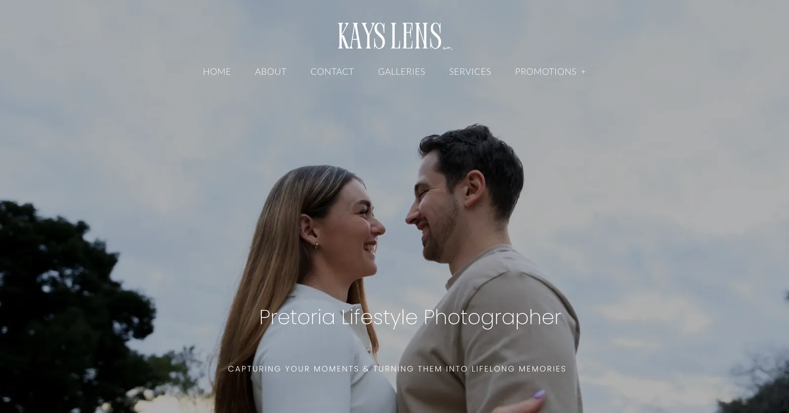
The project brief
A Pretoria photographer who needed the images to carry the site. The brief was the opposite of a service business: the design could be expressive, as long as it never got in front of the photography.
Our mission
Give the photography a home of its own, so the images lead, the design stays out of their way, and every booking enquiry arrives somewhere it cannot get lost.
The main issues to solve
- 01Portfolio scattered across social platforms with no home of its own
- 02Wanted a site that felt made, not templated
- 03Booking enquiries were getting lost in direct messages
- 04The work is the product - the design had to stay out of its way
Design decisions
When creative is the right call
This is the other side of the professional-versus-creative fork. A photographer is judged on taste, so a plain template would actively undersell the work. Here the design was allowed personality - a distinctive type pairing, an asymmetric grid, considered spacing - because for this client the website itself is part of the portfolio.
- A layout that is recognisably designed, not a stock theme
- Full-bleed imagery with room to breathe
- A type treatment that has a point of view
- Restraint everywhere the eye is not meant to go
Animation, used sparingly
Motion was added, but on a tight budget: a soft fade as images enter, a gentle hover state on the grid. Enough to feel crafted, not so much that it delays the work appearing or drains a laptop battery. Every effect respects the visitor's reduced-motion setting and falls back to a plain state.
- Fades and hover states only - no parallax, no scroll-jacking
- Transitions kept short so images are never gated behind them
- Honours prefers-reduced-motion automatically
- Motion is CSS, not a JavaScript animation library
Speed, even with a heavy gallery
An image-led site is a performance risk. The gallery was built to load only what is on screen, serve modern formats at the right size for the device, and hold its layout so nothing jumps as photos arrive. The result looks lavish but stays light.
- Responsive images: each device gets a right-sized file
- Off-screen images deferred until the visitor scrolls near them
- Fixed aspect ratios so the page never reflows on load
- Modern formats with a fallback for older browsers
How it was built
- Type
- Static website with a structured image gallery
- Framework
- Next.js, exported as static HTML
- Hosting
- Edge CDN with an image pipeline
- Content
- Galleries defined in data files; new sets are a redeploy
- Forms
- Booking enquiry posts to a serverless function that emails the studio
- Analytics
- Privacy-friendly, no cookie banner needed
Want a website built the same way?
Every build starts from a fixed published price and timeline.
Pick your type, or WhatsApp Matt and get a straight answer on what your business needs.